Brand guidelines
Every scene begins as a feeling.
Everything that makes Framlo look and sound like Framlo, in one place. Calm, warm and considered: a charcoal stage, a peach highlight, soft rounded type with one elegant italic word.
Four colors. No more.
Dark mode: Ink with a bit of peach
Charcoal everywhere. Peach only for the logo dot, buttons, accent words and a faint warm tint on feature sections.
Light mode: peach and white
Plaster pages, peach-washed cards, solid peach feature bands, Ink text. Clay only for small accent text on Plaster.
- Buttons are Peach with Ink text in both modes.
- Grays, borders and panels are Ink or Plaster at lower opacity. Never add a new hex.
- No gradients in the interface, no glows, no neon. Errors use the accent color with an icon and words; there is no separate red.
- Contrast: Plaster on Ink 16:1 · Peach on Ink 10:1 · Clay on Plaster 4.7:1. Palette on Coolors.
The Director’s frame.
Two corner brackets framing a dot: the gesture a director makes to frame a shot. You frame the idea; Framlo brings it into motion. The wordmark is lowercase “framlo” in Parkinsans Medium, always outlined.





- The dot is always the accent (Peach on dark, Clay on light, Ink on Peach). Brackets and wordmark are always the text color.
- Clear space: the dot’s diameter on every side. Minimum size: lockup 96px wide, tile 16px, bare symbol 20px.
- Never rotate, mirror, outline, stretch, add shadows or gradients, or recolor outside the four colors. The old ✳ sparkle is retired.
Soft and rounded, with one elegant word.
Parkinsans does almost everything, set light for a calm voice. Newsreader Italic appears in exactly two places: the accent word in a big heading, and the small eyebrow line above it. Both are free (SIL Open Font License).
Good ideas deserve direction.
Make something that moves you.
Your decisions are the throughline.
Keep the scene connected.
Your imagination, your direction
Shape an animated mockup, make it yours, then refine it through reviewed Blender production.
Let’s make it
- One accent word per heading, the emotional one. Never a whole sentence in italic.
- No all-caps labels. Headlines stay light; weight is for buttons and labels.
- Nothing smaller than 14px (13px only for legal footers). On phones: display 40, H1 36, H2 30.
Studio: one object, one light, lots of quiet.
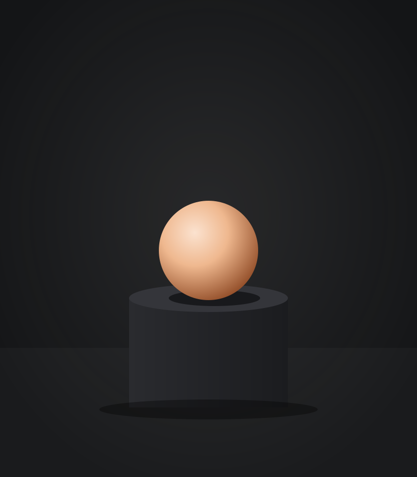

- Light: one large soft warm key from the upper left. No hard shadows, no colored gels.
- Camera: 50–85mm, eye level; the subject takes at most a third of the frame. Leave room for a headline.
- Materials: satin ceramic, matte plaster, brushed metal, travertine. Never glossy chrome.
- Never: neon, glow, lens flares, holograms, particles, busy scenes, realistic faces, or text baked into images.
Glide, like a slow camera.
One smooth ease-in-out curve for everything. Things are revealed, never thrown in: the logo’s brackets draw themselves and the dot settles; headlines wipe in; sections ease in like a camera push.
Timing
--ease-glide: cubic-bezier(.65, 0, .35, 1)
Reveals 1400ms · Scene push 2600ms · Hovers 500ms · Press 150ms · Stagger 200ms
Rules
No bounces or springs. Hovers move 2px at most; entrances travel 16px at most. Animate entrances once. Always honor reduced motion.
Line, with a touch of peach.
Rounded 1.6px lines on a 24px grid, with one peach area in each icon, like the logo’s dot. Every icon comes in a dark-mode and a light-mode file.


Four details, all from the logo.
Scene markers
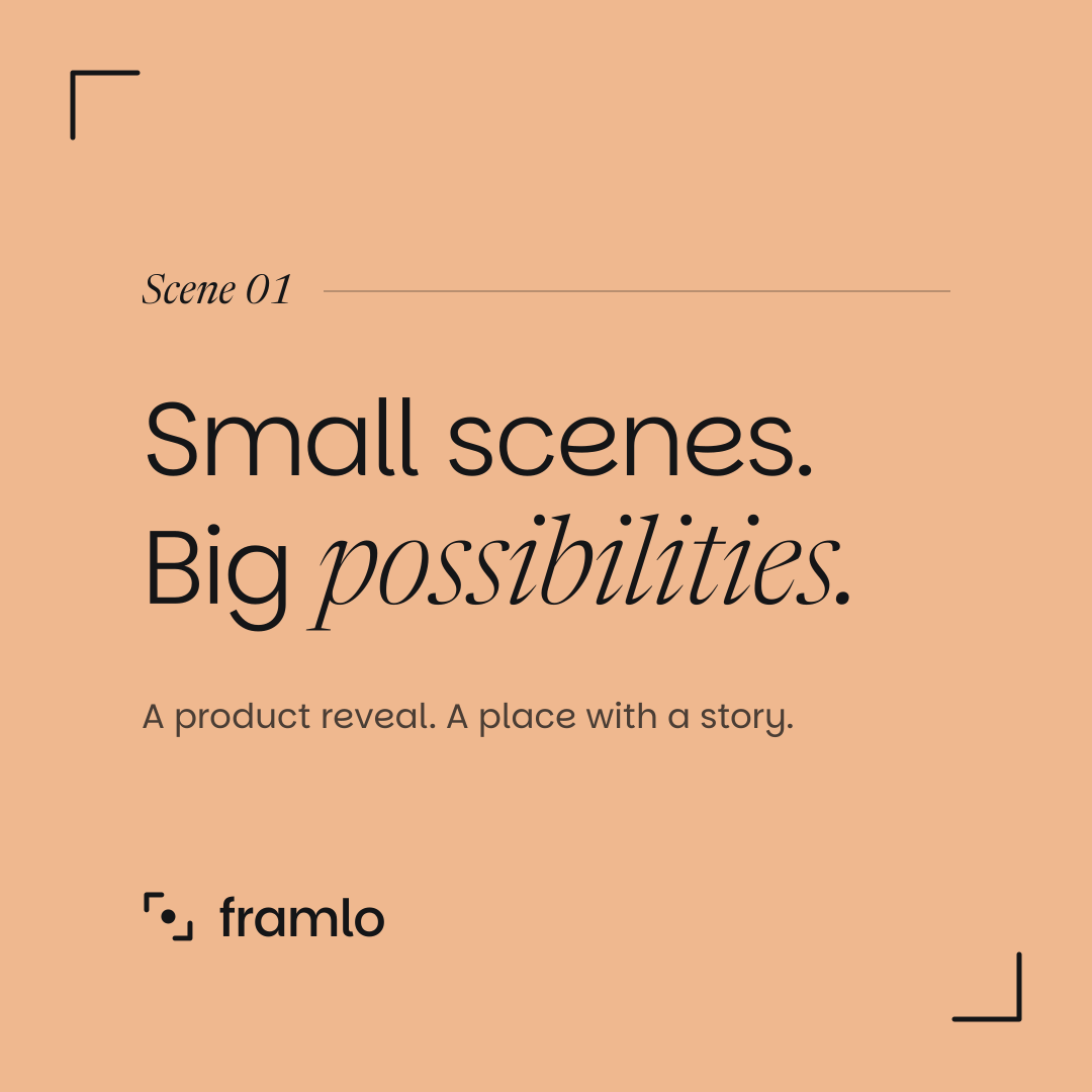
Sections are numbered as scenes, in the italic accent, followed by a hairline.
Frame corners
The logo’s brackets frame the hero render or video. Once per page.
The dot
The peach dot is the list bullet and the divider ornament.
Keyframe steps
- Spark
- Shape
- Refine
Progress shown as keyframes on a timeline.
A creative friend who thinks in scenes.
Story mode
For big moments: hero headlines, section titles, email subjects, empty states, loading. Short, evocative, with one film image.
Friend mode
For everyday moments: buttons, forms, errors, help. Warm, plain and direct. Clarity first, charm second.
| Hero headline | Every scene begins as a feeling. |
|---|---|
| Main button | Let’s make it |
| Upload error | Hmm, that file didn’t make it. Try a PNG or JPG under 20 MB? |
| Form error | We need an email so we can get back to you. |
| Success | Got it. We’ll be in touch within two days. |
| Email subject | Your first take is ready |
| Empty project | An empty stage, waiting for your first idea. |
| Loading | Setting the scene… |
- One metaphor per line, at most. Buttons are verb-first and personal. Talk to one person, with contractions.
- Explain 3D jargon or skip it. Never use AI hype words (revolutionary, magic, unleash, seamless), emoji, or “Oops!”.
Built from the same pieces.
Load /brand/tokens.css then /brand/components.css. Every class below is ready to use.
A real example as the placeholder, never the label again.
We need an email so we can get back to you.
Feature band
Solid peach in light mode, a warm tint in dark.
Ready to use.
Fonts and code
Parkinsans (woff2)Newsreader Italic (woff2)tokens.csscomponents.css